https://boda.su/en/posts/id2291-burnt-orange-is-the-new-red-2026-interior-trend-guide
Burnt orange is the new red: 2026 interior trend guide
Burnt orange is 2026's new red: ideas for living rooms and offices
Burnt orange is the new red: 2026 interior trend guide
Discover why burnt orange - the new red - leads 2026 interiors. Get living room and office ideas, pairings, and lighting tips to warm spaces without overwhelm.
2025-12-04T13:30:50+03:00
2025-12-04T13:30:50+03:00
2025-12-04T13:30:50+03:00
2026 is shaping up to revive the spirit of the seventies: warm, amber, gently gilded tones are stepping back into the spotlight. The star of the palette is a retro hue often called burnt orange or the new red in interior design. Experts see in it a blend of warmth, comfort, and modernity that slips easily into everything from a living room to an office.What this shade is and why it’s taking overThe seventies were defined by a fondness for a fiery orange‑red. Now it returns with a new edge: deeper, slightly jewel‑like, and far more adaptable. Designers say this color has a way of warming a space, setting a comfortable mood while staying current and refined. That duality explains why it is poised to become a favorite in the year ahead—few colors manage to feel both nostalgic and fresh without shouting.Where and how to use it in the living roomTexture and pairings. A plush orange sofa at the center of the room can carry the scene as a vivid focal point. Pairing it with light walls amplifies the shade’s warmth. Retro‑leaning accents—think lamps and armchairs—sit naturally alongside the dark wood of a coffee table.Layout ideas. Consider dedicating one wall to your accent color, then mount shelves or artwork in adjacent tones to echo it. Add textiles—pillows, curtains, a throw—in variations of the new red for a cohesive look. Keep the surrounding palette neutral; pale walls and floors let the color breathe instead of overwhelming the room.Practical tipsTest a range of tones, from deeper burnt orange to amber with a golden cast, and strike a balance between vibrancy and calm.Make lighting do the heavy lifting: warm light enriches the color’s depth and invites a cozy atmosphere.Layer in tactile materials such as suede, velvet, and wood to reinforce the shade’s character.What designers sayThe rationale. The retro burnt orange proves steady and versatile—its presence on 2026 trend lists underscores that. It can quickly refresh an interior, adding friendliness and energy without tipping into excess.Outlook for the year. In 2026, retro tones will appear more often as accents in living rooms and offices. A few targeted color notes in this shade are enough to “update” a space.At this point, the new red reads as more than a trend; it becomes a practical tool for shaping warmth and comfort. It slips into a range of styles and settings, from a snug living room to a polished office. The key is restraint—and a thoughtful mix with neutral tones and textured materials—so the color feels confident rather than loud.
burnt orange, new red, 2026 interior trends, living room ideas, office decor, retro seventies palette, accent wall, warm lighting, textures velvet suede wood, modern retro style, color pairings
2025
articles
Burnt orange is 2026's new red: ideas for living rooms and offices
Discover why burnt orange - the new red - leads 2026 interiors. Get living room and office ideas, pairings, and lighting tips to warm spaces without overwhelm.
Generated by DALL·E
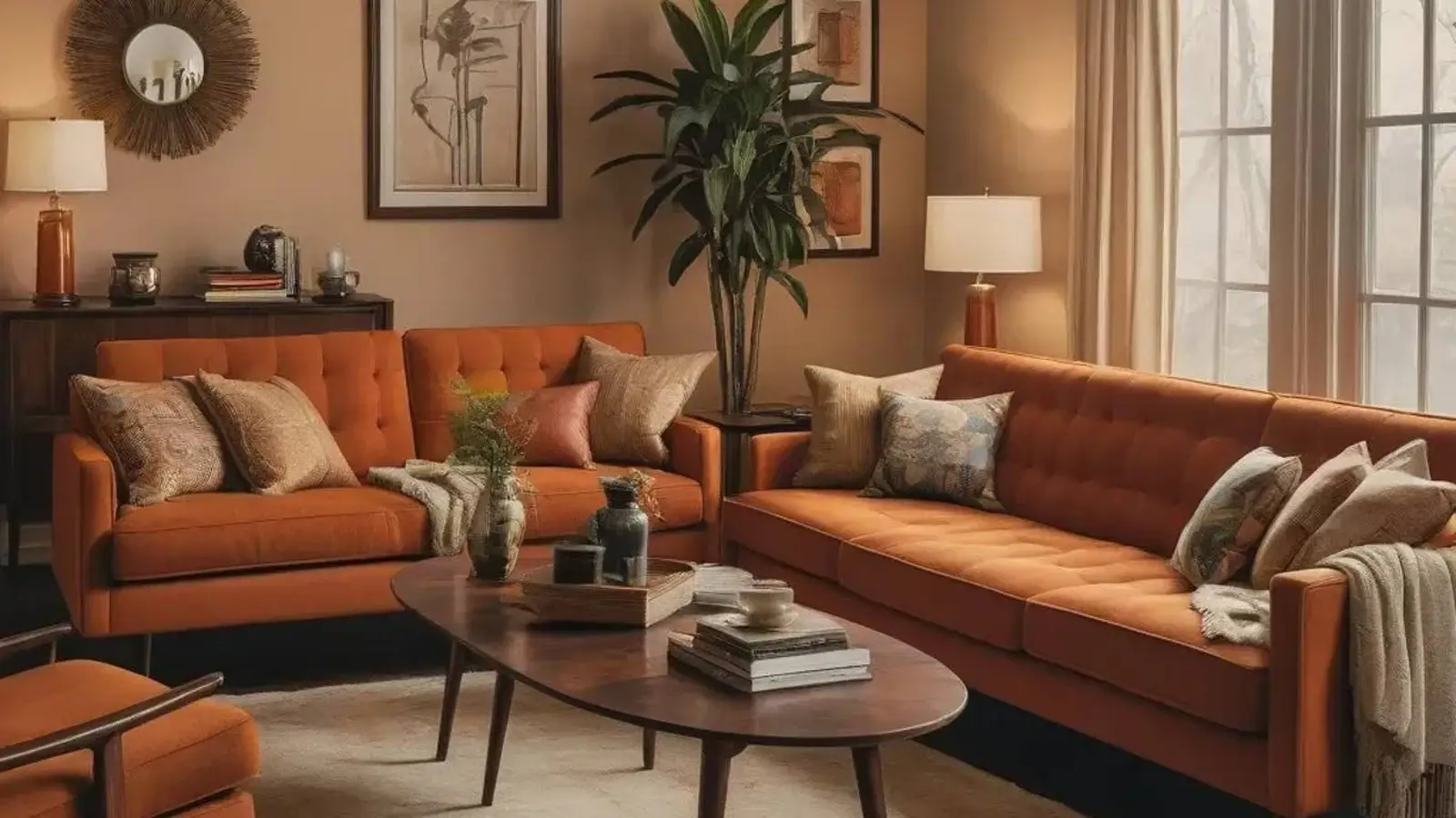
2026 is shaping up to revive the spirit of the seventies: warm, amber, gently gilded tones are stepping back into the spotlight. The star of the palette is a retro hue often called burnt orange or the new red in interior design. Experts see in it a blend of warmth, comfort, and modernity that slips easily into everything from a living room to an office.
What this shade is and why it’s taking over
The seventies were defined by a fondness for a fiery orange‑red. Now it returns with a new edge: deeper, slightly jewel‑like, and far more adaptable. Designers say this color has a way of warming a space, setting a comfortable mood while staying current and refined. That duality explains why it is poised to become a favorite in the year ahead—few colors manage to feel both nostalgic and fresh without shouting.
Where and how to use it in the living room
Texture and pairings. A plush orange sofa at the center of the room can carry the scene as a vivid focal point. Pairing it with light walls amplifies the shade’s warmth. Retro‑leaning accents—think lamps and armchairs—sit naturally alongside the dark wood of a coffee table.
Layout ideas. Consider dedicating one wall to your accent color, then mount shelves or artwork in adjacent tones to echo it. Add textiles—pillows, curtains, a throw—in variations of the new red for a cohesive look. Keep the surrounding palette neutral; pale walls and floors let the color breathe instead of overwhelming the room.
Practical tips
Test a range of tones, from deeper burnt orange to amber with a golden cast, and strike a balance between vibrancy and calm.
Make lighting do the heavy lifting: warm light enriches the color’s depth and invites a cozy atmosphere.
Layer in tactile materials such as suede, velvet, and wood to reinforce the shade’s character.
What designers say
The rationale. The retro burnt orange proves steady and versatile—its presence on 2026 trend lists underscores that. It can quickly refresh an interior, adding friendliness and energy without tipping into excess.
Outlook for the year. In 2026, retro tones will appear more often as accents in living rooms and offices. A few targeted color notes in this shade are enough to “update” a space.
At this point, the new red reads as more than a trend; it becomes a practical tool for shaping warmth and comfort. It slips into a range of styles and settings, from a snug living room to a polished office. The key is restraint—and a thoughtful mix with neutral tones and textured materials—so the color feels confident rather than loud.