https://boda.su/en/posts/id145-rethink-white-ceilings-designer-approved-color-ideas
Rethink White Ceilings: Designer-Approved Color Ideas
Why a White Ceiling Isn’t Always Best—and What to Use Instead
Rethink White Ceilings: Designer-Approved Color Ideas
Discover when a white ceiling backfires—and what to use instead: warm pastels, smoky blues, dark matte tones, texture, ombre and color zoning for interiors.
2025-08-29T14:21:17+03:00
2025-08-29T14:21:17+03:00
2025-08-29T14:21:17+03:00
For years, a white ceiling was treated as the safe default. It bounces light, makes a room feel larger, and rarely clashes with the walls or furniture. Yet recent design practice suggests it isn’t a cure-all. In some interiors, white does the opposite of »fresh”—it can make a space look dated.
Why white isn’t always a win
A white ceiling can drain character from a room, especially when the rest of the scheme is also pale. The result can feel clinical, closer to a hospital or office than a home. White also exposes every surface flaw—cracks, uneven patches, paint drips—an effect that’s particularly noticeable in older buildings. And in apartments with low ceilings, white doesn’t fix the »squashed” sensation; the high contrast between walls and ceiling can sharpen the separation and visually »slice off” the top plane.
What designers are turning to instead
Warm pastels. Cream, light beige, or soft peach lend a gentler mood. These tones add coziness and bring a subtle sense of warmth to the whole room.
Blue-gray and smoky shades. Reminiscent of a daytime sky or light cloud cover, these hues create an appealing accent without weighing a space down. They suit bedrooms and bathrooms especially well.
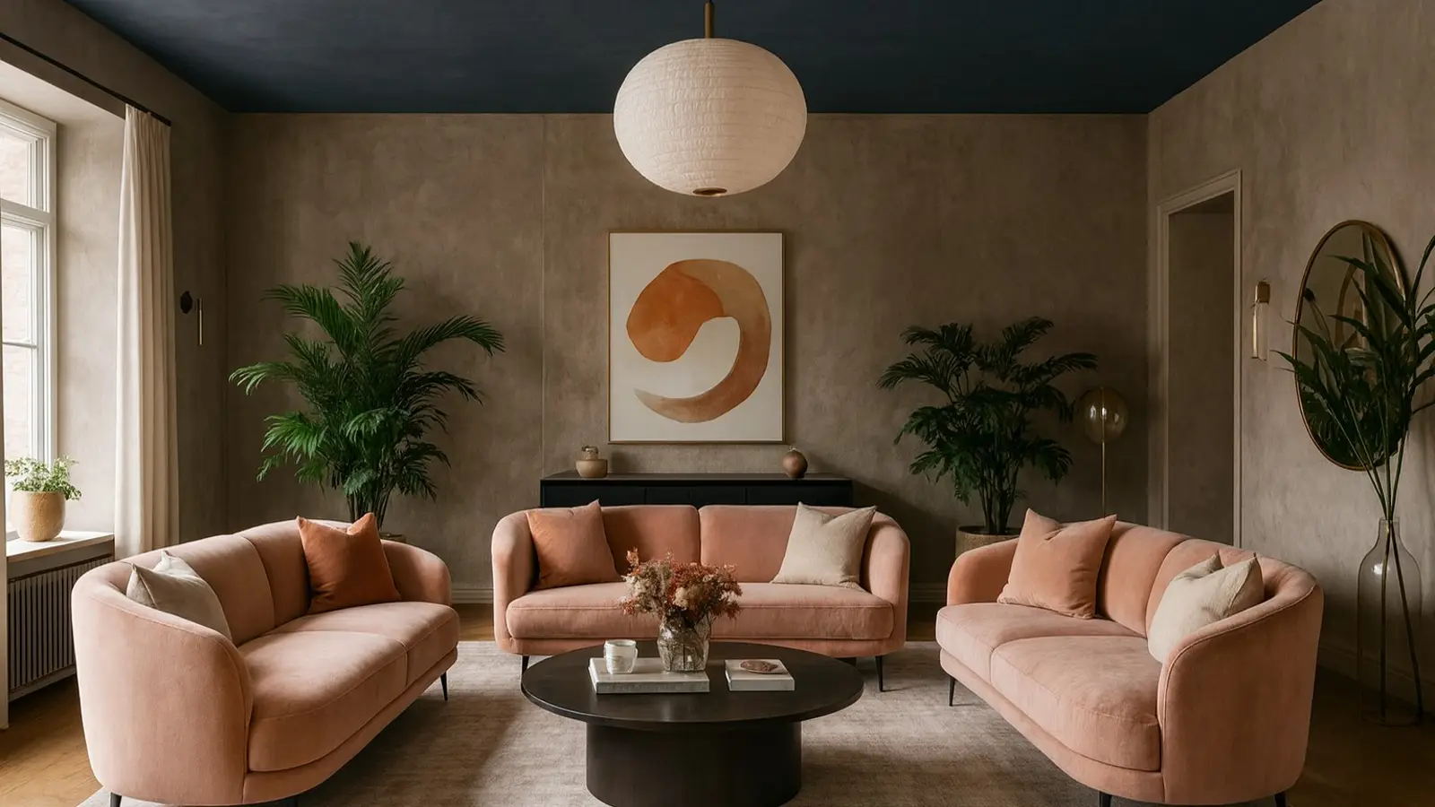
Dark matte colors. Graphite, navy, or chocolate can be bold, but in rooms with strong natural or artificial light they pull the scheme together and add depth. Living rooms and home offices often benefit from this approach.
Textured finishes. Decorative plaster or paint with added wax introduces a tactile surface and a crafted feel, not just a new color.
Ombre effects. Gradual shifts—say, deeper near the walls and lighter toward the center—help disguise awkward geometry and make the ceiling feel more dynamic.
Color-based zoning. In studios and open-plan layouts, ceiling color can define function. A kitchen zone, for example, might be a half-tone darker than the adjacent lounge area.
A white ceiling isn’t a mistake—but it isn’t universal either. It suits some interiors, while in others it highlights outdated features and flattens the mood. If the goal is more individuality, comfort, or visual interest, it’s worth exploring alternatives. Color, texture, and form at the top of the room matter as much as furniture or wall finishes. Chosen well, the ceiling unifies the space and sets the tone without demanding attention.
White Ceiling, Ceiling Color Ideas, Interior Design, Dark Ceiling, Pastel Ceiling, Blue-Gray Ceiling, Textured Ceiling, Ombre Ceiling, Ceiling Zoning, Living Room, Bedroom, Bathroom
2025
articles
Why a White Ceiling Isn’t Always Best—and What to Use Instead
Discover when a white ceiling backfires—and what to use instead: warm pastels, smoky blues, dark matte tones, texture, ombre and color zoning for interiors.
Generated by Dall-e
For years, a white ceiling was treated as the safe default. It bounces light, makes a room feel larger, and rarely clashes with the walls or furniture. Yet recent design practice suggests it isn’t a cure-all. In some interiors, white does the opposite of “fresh”—it can make a space look dated.
Why white isn’t always a win
A white ceiling can drain character from a room, especially when the rest of the scheme is also pale. The result can feel clinical, closer to a hospital or office than a home. White also exposes every surface flaw—cracks, uneven patches, paint drips—an effect that’s particularly noticeable in older buildings. And in apartments with low ceilings, white doesn’t fix the “squashed” sensation; the high contrast between walls and ceiling can sharpen the separation and visually “slice off” the top plane.
What designers are turning to instead
Warm pastels. Cream, light beige, or soft peach lend a gentler mood. These tones add coziness and bring a subtle sense of warmth to the whole room.
Blue-gray and smoky shades. Reminiscent of a daytime sky or light cloud cover, these hues create an appealing accent without weighing a space down. They suit bedrooms and bathrooms especially well.
Dark matte colors. Graphite, navy, or chocolate can be bold, but in rooms with strong natural or artificial light they pull the scheme together and add depth. Living rooms and home offices often benefit from this approach.
Textured finishes. Decorative plaster or paint with added wax introduces a tactile surface and a crafted feel, not just a new color.
Ombre effects. Gradual shifts—say, deeper near the walls and lighter toward the center—help disguise awkward geometry and make the ceiling feel more dynamic.
Color-based zoning. In studios and open-plan layouts, ceiling color can define function. A kitchen zone, for example, might be a half-tone darker than the adjacent lounge area.
A white ceiling isn’t a mistake—but it isn’t universal either. It suits some interiors, while in others it highlights outdated features and flattens the mood. If the goal is more individuality, comfort, or visual interest, it’s worth exploring alternatives. Color, texture, and form at the top of the room matter as much as furniture or wall finishes. Chosen well, the ceiling unifies the space and sets the tone without demanding attention.